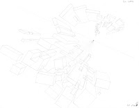
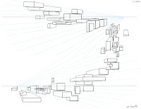
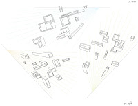
by far one of my favorite classes this term, our final project was to first make a list of objects we found visually or conceptually interesting. once we felt that our lists were complete enough, we chose our favorite one from them. the objects i picked were mushrooms.
and then the grand premise of this object we picked: design the interior or exterior of a church devoted to the worship of that object.
fun. times.
i am strongly considering throwing this into photoshop and painting it when i get back from break as this is one of my strongest line illustrations ever. though we only covered the basics and principles of perspective in this class, their applications led us to create extremely dynamic scenes and view points. it was an incredible amount of fun to be had in that class :D
(this assignment was also handed out during the same time my photoshop matte painting was announced, so I sort of used the same object of focus for both :3)
Sunday, December 19, 2010
end of term: photoshop for digital production
our final project for photoshop class was to build our own matte paintings of a place that exists outside of our own world.
i thought a giant mushrooms underwater would be good fun :D
for a first attempt at a matte painting, i learned so much more than i thought I ever could. I got away with certain parts of the image mostly due to the fact that the scene is underwater, but emulating the lighting and its diffusion through water was such an immense challenge to try and bring that believability.
Wednesday, December 15, 2010
end of term: figure drawing
it's the last week of my first term at gnomon. i thought i'd post a few dumps of my classwork on here. why? just cuz :p
first and foremost and mostly because it's the only class i have scanned and laid out are my figure drawings.
this class was pretty much life changing. for realsies. I can never thank Jack Bosson enough, he was an amazing teacher and really great to work with. Drawing nekkid people has never been more fun or educational. Even though I walk away from this class knowing that i could still use alot of work, i'm not daunted by that prospect anymore. instead, i am welcoming the challenge and I'm unafraid to meet it.
Friday, November 19, 2010
hunting knife concept
Saturday, November 13, 2010
photo manipulation, numbah 2!
another photo manipulation i decided to do for class all asian long neck vampire, complete with scales. i thought the first fishbowl manipulation might not have been enough in terms of changes to the actual element, so i tried to really bring it to become something completely different, which i think was pretty successful!
thanks in advance for taking a look!
Friday, November 12, 2010
photo manipulation assignment
Friday, November 5, 2010
Drag racing mortal enemies
So for this week's perspective assignment, we had to practice drawing ellipses in perspective. what better way to exercise that than to select an object, figure out what its mortal enemy is and pit them against one another in an all-or-nothing drag race?
i chose an axe, its mortal enemy being a chain saw.
WINNER: OLD SCHOOL!
i chose an axe, its mortal enemy being a chain saw.
WINNER: OLD SCHOOL!
Wednesday, October 20, 2010
a laughing gas machine
Saturday, October 16, 2010
photoshop sky swap
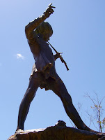
this week's photoshop assignment was to swap out the sky in an image with a night sky. here's the before shot, a photograph of the statue of Peter Pan in London, taken from Google:
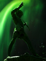
and here's the after shot, sky switched with a tweaked photograph of the Aurora Borealis, also from Google:
i totally underestimated the difficulty of the assignment; instead of taking me an hour or two, this took about 4-5 hours to get done O_o but selections and masks are now officially the most helpful tools i've encountered in photoshop :D thanks in advance for looking!
Friday, October 15, 2010
photoshop textures
assignment 1 from my Photoshop for Digital Production class! Create 5 textures using blending modes and adjustment layers. Since I've never really sat down and tried to make believable textures before, this was a challenge. I had a lot of fun with it though since we weren't limited to specific subject matter, but i decided to take it a bit slow to make sure i understood what i was doing.
overall, i'm satisfied with these. i feel that they are pretty good, though without having many other eyes to see if they're believable or not it's hard to tell. so we'll see!
Sunday, October 10, 2010
school has begun!
Classes started 2 weeks ago at Gnomon School of VFX, and guess what? I have probably learned more there in the past fortnight than my 4 years at UofM A&D. That's not to say that some of the stuff i learned while i was there wasn't worth it, but it wasn't the foundation that i needed to take steps to being awesome :p
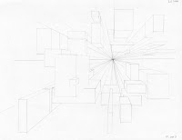
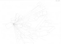
going back to basics has been very refreshing, especially now that I know what mindset to approach it with. spending an entire week of just drawing primitives was actually fun O_O but this past week, i've been working on my perspective homework which i'm surprisingly rather proud of. Here are the finished 1 point perspectives :D
traditional pencil on paper (sorry if they're not too awful clear :/):
digital in photoshop with grids made in illustrator (yes, i'm super weird):
overall, super fun if not extremely time consuming =___=.
Friday, September 24, 2010
Freyja
from drink and draw
here's the sketch from drink and draw last night: kiki discovers google maps!
i haven't decided if i want to color it at all, but at least i've got the pencils scanned. i am really liking the feel of this sketch though, so i might even restart and do a more polished and less hectic version. it's time to experiment :D
Thursday, September 23, 2010
do we rise when we fall?
after pondering my lack of sequential art skills, I decided to apply them to an illustration I'd been working on and create a triptych with it. I'm really happy with how it came out, and more than anything, it felt amazing to practice a style of water color painting i hadn't dared explore before: washes O_O so many mistakes! so much time to regret them! gaaahhh!
it's also inspired me to focus a some more on the storytelling of a piece rather than get too fixated on the technique. truly, their development can go hand in hand and i'm glad that i've discovered that :D
anyways, thanks for looking in advance!
it's also inspired me to focus a some more on the storytelling of a piece rather than get too fixated on the technique. truly, their development can go hand in hand and i'm glad that i've discovered that :D
anyways, thanks for looking in advance!
Sunday, September 19, 2010
some more silhouettes
after the first run of silhouettes, i decided to give it another brief go and see if i could get a few more forms out. it came out okay, but not as great as the first run. i still do like a lot of them though, but it now needs some focus. on that note:
after doing these silhouettes, I've found that I'd actually like to create 3-5 different Bone Imps, approaching their designs as if I were designing fighting game characters. it's been a great way to also figure out how to design different characters or units as if in an rpg setting as well as a way to focus on what i'd like the outcome sort of be :D time to figure out which ones I'd like to pursue!
Thursday, September 16, 2010
presenting a bone imp
Wednesday, September 15, 2010
illustrating understanding
Saturday, September 11, 2010
somethin' new and been a long time coming
i have finally gotten off my ass and designed a new business card. looking at my old ones made me want to vomit ever so slightly. the shame!
the first image is the illustration that inspired the card's design. second set that's all in a portrait orientation is the one i'll be sending off to print soon and really excited for how they're going to look :D
Tuesday, September 7, 2010
random illustration
taking a bit of a break from gray scale for now and actually trying to work with color, particularly that of skin tones. started as a sketch and it turned out to be a pretty neat illustration :) i still need work; i think i need to use less brush strokes in the darker value areas (or at least a softer brush) but overall, good progress i feel :D
Sunday, September 5, 2010
some more environment grayscales...
some more gray scales of the previous post. The process is getting easier as I practice, so that's a good sign :) the last one in this series was pretty much for the sake of fun. nothing too practical or realistic about it. overall though, i'm glad to feel that it's getting a bit more fluid. more practice! jia you!
Saturday, September 4, 2010
and a new month comes round the corner...
Sunday, August 22, 2010
artifacts of the past
sorting through old art is a painful process when you look back and are like 'what was i thinking?' but then there are those gems of old that still glow when you look at them and you can reflect and say 'yeah, that was good...'
this is probably one of my gems. i just uploaded this to my website because i thought it was one of the better sketches i've done in about forever, and i remember how much fun i had with it :)
Saturday, August 21, 2010
mo exercises
Thursday, August 19, 2010
some PS exercises
Tuesday, August 17, 2010
THE INTERNET COMETH!!
yes. the day has arrived. internet is hooked up to my computer. REJOICE!
I've also updated my website! Check it out at http://portfolio.lalalichan.com. stuff coming soon!
Friday, August 6, 2010
so far, so...well....so so....
we've arrived in LA! Hooray, right?! well, not so much a 'hooray', more like a 'hmmm...kay..' the road trip out here was amazing, but upon arrival at our destination, the fears are kicking in hard-freaking-core :/ the thrill of adventure right? once we've settled into an apartment and gotten internet up and running, updates will be more forthcoming. thanks for checking in!
Sunday, July 18, 2010
sooooo, a steampunk/pirate Green Lantern?
as the month is coming to a close and the move edges closer and closer to an uncomfortable distance from me, i decided to just draw an interpretation of something fun and meaningful.
for two of my good friends who decided to get hitched, i drew my version of a Green Lantern. it was a lot of fun and a bit scary to draw since this is a) one of the first times i've completed a strong male character illustration and b) it's been a good loooooong while since i've inked with nib and brush, but i'm happy with the way it turned out and i hope they are too :) congrats guys!
Sunday, July 11, 2010
decided and done :D
Subscribe to:
Posts (Atom)